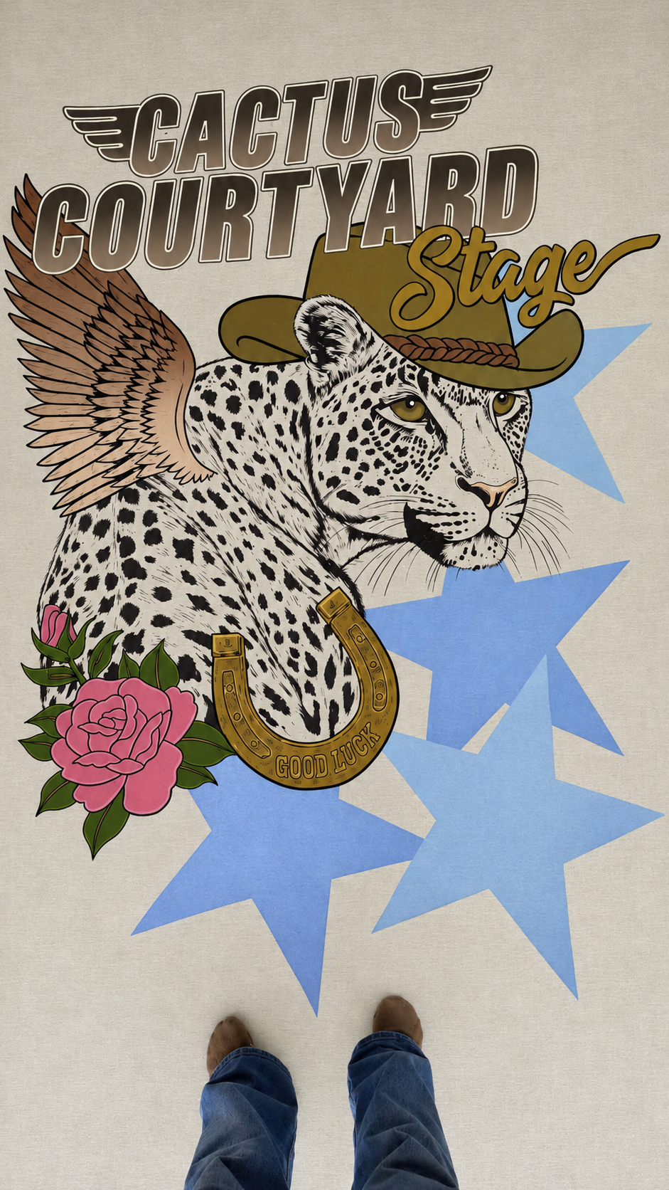
There is something particularly satisfying about working on a large scale. The freedom to move beyond the dimensions of a traditional canvas, work directly onto an expansive surface and become completely absorbed in the finer details is an aspect of painting I have always loved.
Earlier this year, I was approached by Byron Bay fashion label Spell Designs to create a large-scale painted backdrop for their Easter Weekend 2026 celebrations. The event would bring together local musical artists for a weekend of live performances, with guests invited to enjoy the music and explore Spell's latest collection. My role was to bring one of the collection's existing artworks to life in a much larger format, creating a backdrop for the musicians to perform in front of throughout the weekend.
The artwork was based on Spell's Howdy Inn Oversized Tee, a festival-inspired biker T-shirt featuring a rather magnificent spotted big cat, Western-inspired detailing and a collection of vintage-style motifs. It had all the ingredients of a classic Spell graphic: a little Americana, a little rock 'n' roll and plenty of character. I loved the opportunity to take an existing illustration and reinterpret it through paint, retaining the personality of the original artwork while translating it into something with an entirely different physical presence.
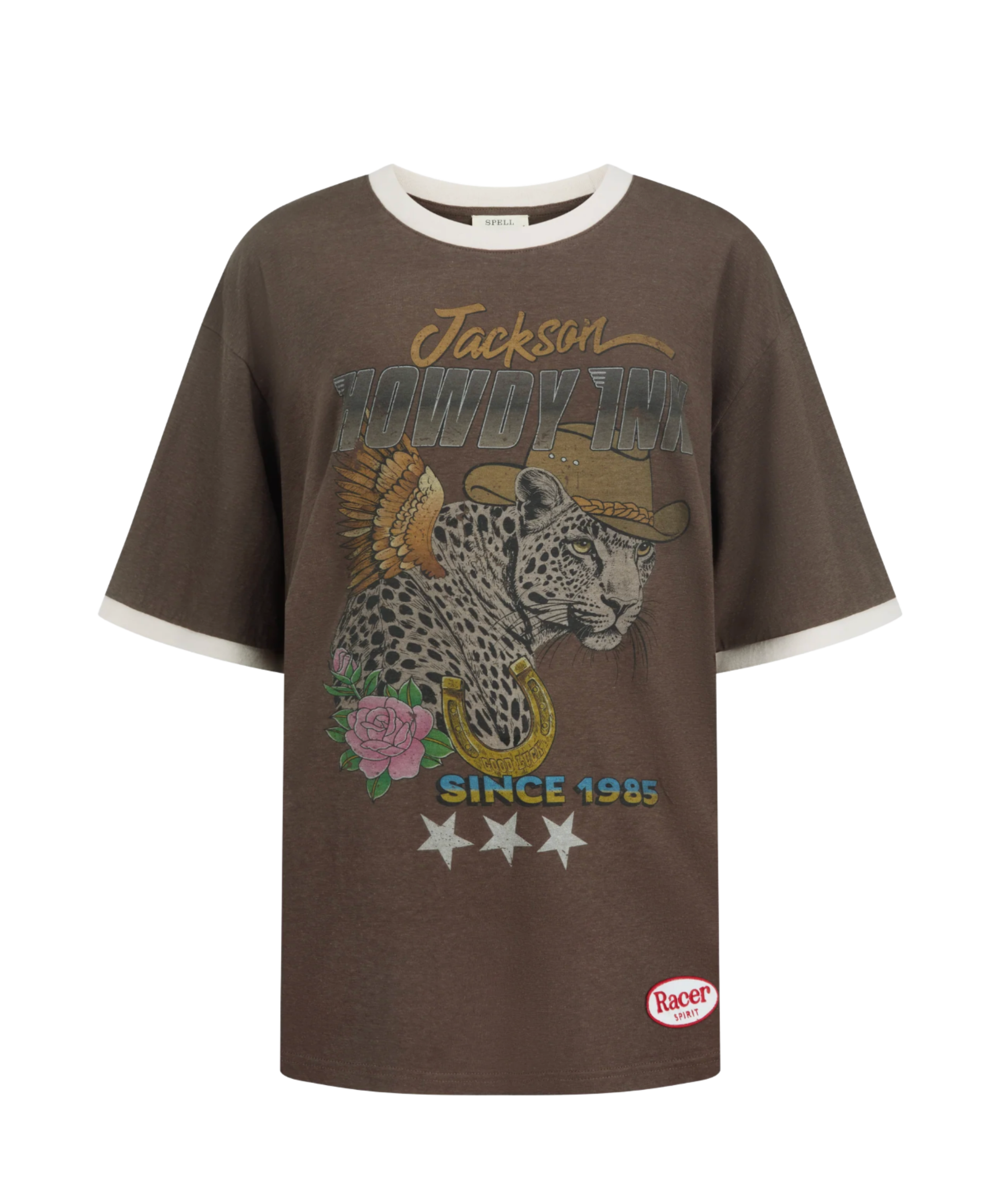
The Howdy Inn Oversized Tee available at Spell.com
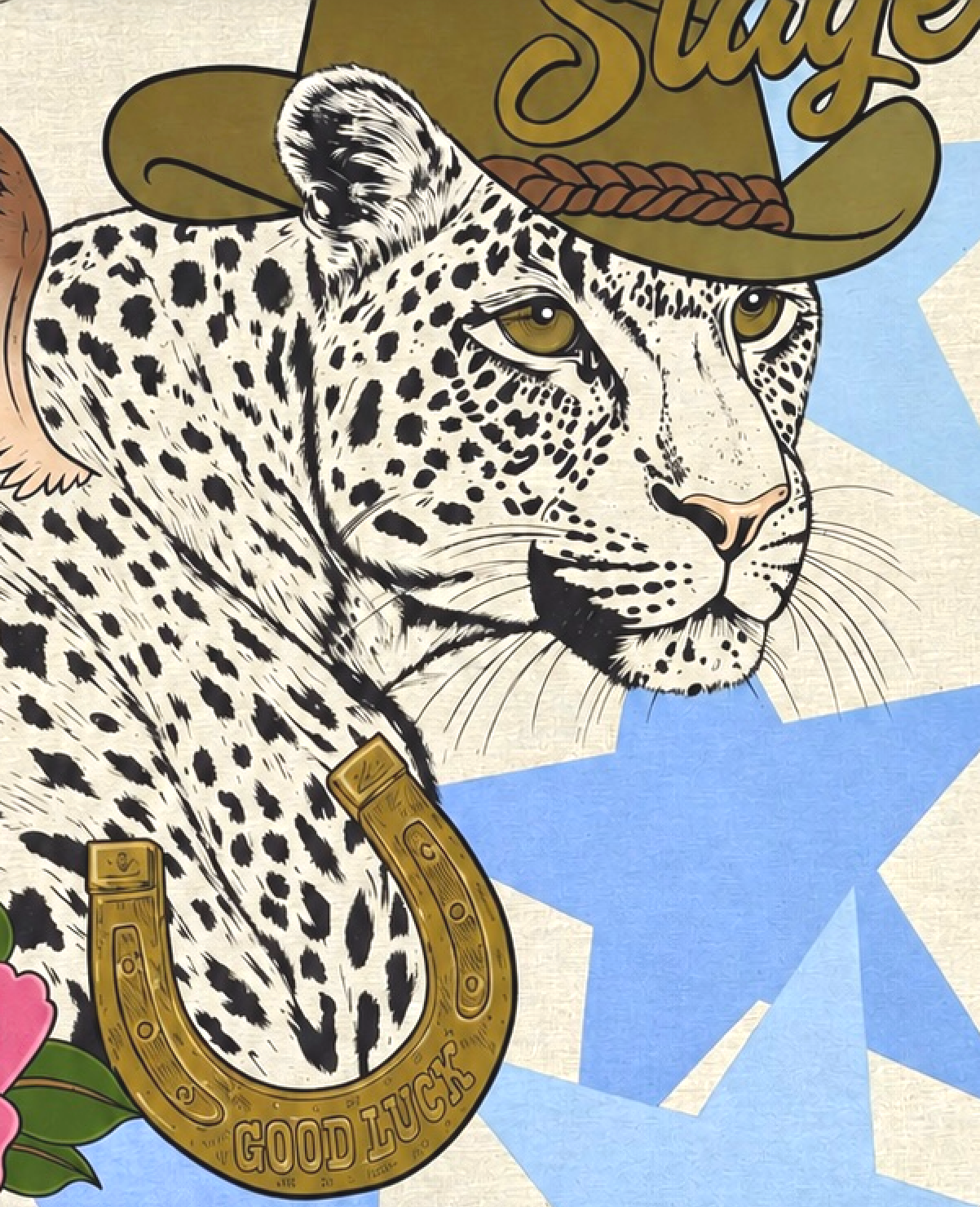
A few days on the studio floor
I spent several days working on the backdrop, laying the enormous sheet of fabric across the floor of my studio. Working at this scale changes the way you approach a painting. Rather than having a canvas positioned in front of you, the work becomes something you physically move around, stepping back to consider the overall composition before getting up close to work through individual details.
I particularly enjoy this way of working. Large-scale paintings allow me to become completely immersed in the process, often losing track of time as I move from one section to the next. There is a certain rhythm to it: building up the larger shapes and colours before gradually working into the finer details that give an illustration its character.
With so many individual elements making up the composition, there was plenty to keep me occupied. From the intricate markings of the cheetah and the individual feathers of the wings to the decorative detailing of the horseshoe and the traditional tattoo-inspired roses, I wanted to give each component the same attention I would to a much smaller painting. Even at this scale, it is often the smallest details that make the biggest difference.
Colour, contrast and a little experimentation
The colour palette was one of my favourite aspects of the project. I worked with a combination of earthy, cooler browns and antique gold tones, balanced against softer baby blue stars and an unexpected pop of Barbie pink in the roses.
I particularly loved the contrast between the more muted Western-inspired palette and the brighter pink florals. The roses had a distinctly traditional tattoo aesthetic, with bold outlines, layered petals and deep green foliage. Their colour brought a welcome vibrancy to the composition without overpowering the surrounding elements.
Another detail I enjoyed experimenting with was the ombré blending technique used across the angel wings. Gradually transitioning between tones created a sense of depth and movement through the feathers, giving them a softer, dimensional quality while maintaining the graphic character of the original design. It was a small technical detail, but one that made the process particularly enjoyable.
I find that commissions often introduce opportunities to experiment with techniques or approaches I might not otherwise explore. Working from an existing artwork provides a clear visual direction, but interpreting it through a different medium and at a different scale leaves room for those small creative decisions along the way.

Hilz Music performing in the Cactus Courtyard @hilzmusic

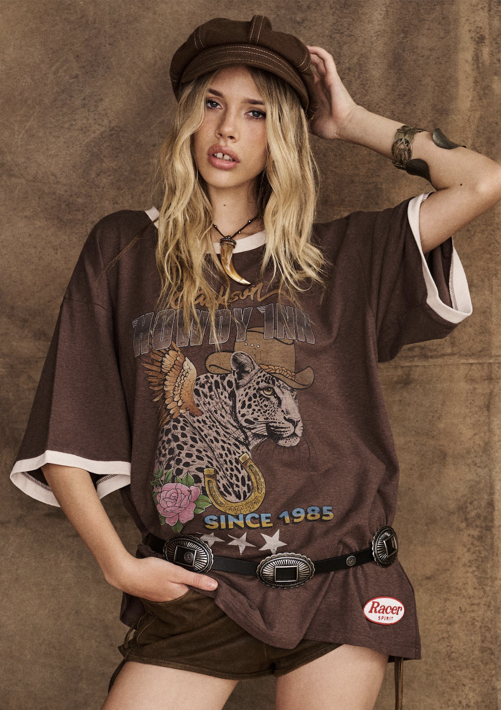
From Spell Design’s The Festival Muse Edit
From the studio to the stage
After several days of painting, the finished backdrop was ready to leave the studio and make its way to the Easter weekend celebrations.
Seeing the scale of the finished piece outside the context of my studio was a particularly rewarding part of the project. The fabric was installed high behind the stage, creating a backdrop for the musicians as they performed throughout the weekend. What had spent several days spread across my studio floor was now elevated above the performers, becoming part of the visual setting for the live music and festivities.
There is always something interesting about seeing a work move beyond the environment in which it was created. In the studio, the experience is quiet and quite solitary: hours spent concentrating on colour, composition and the smallest details. Once installed, the work takes on a different role, becoming part of a shared experience and being encountered by people in an entirely different way.
It was a pleasure to be invited by Spell Designs to collaborate on the project, particularly as a Byron Bay-based artist working with a local fashion label. The opportunity to take an existing piece of graphic artwork and translate it into a large-scale painted installation was a lovely departure from my usual studio work.
A few days spent painting on the studio floor, experimenting with colour and getting lost in the details. It was exactly the kind of project I love.